TASK: Understand the DataTemplate element

Contents
In this task you will understand the properties of the <Datatemplate element, that designs a single cell in a grid-like listing. In this example we choose the <BaseQuery Name="Fred4Libs" in the FRED4_Config.xml configuration file. |
You will be able to perform this task only if you already performed the TASK: Understand the DirectoryStyleList element. |
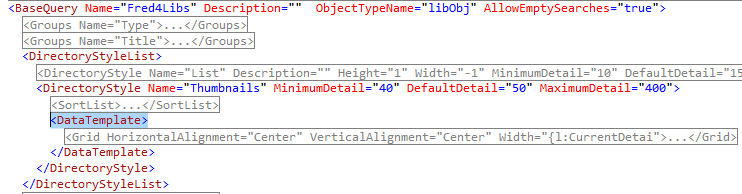
1.Expand the <BaseQuery Name="Fred4Libs" element, and then expand the <DirectoryStyle Name="Thumbnails" element. 2.Expand the <DataTemplate> element. At this point, your code will look like:
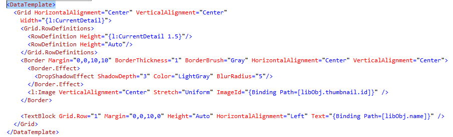
3.Please notice that the <DataTemplate> element encloses additional elements, such as <Grid. The purpose of that element is to define an invisible screen grid (cells) where to place the content to display. In this particular case, we want to display the object library thumbnail and its caption. 4.Expand the <Grid element and all other sub-elements and look what we got there. •The first two <Grid properties are about how to align the content in the cell: in this example, both are centred (HorizontalAlignment="Center" and VerticalAlignment="Center"). •Then, the cell width is defined, and in this particular case it is relative to the slider position, therefore, its value is not absolute but expressed as Width="{l:CurrentDetail}". This allows users to increment the size of the cell, and to make the image larger. •The content displacement on screen is driven by the "virtual table", containing rows and columns. In this case, we want only one column, and being so, we don't need to define it. But, as we want to have more than one row, the code between <Grid.RowDefinitions> and </Grid.RowDefinitions> is doing that: every line defines one row and its height. The first row height is 50% taller of the width, again expressed as the slider position. The second row height is "as much as needed", expressed by the "Auto" value. •The thumbnail itself is defined in <l:Image VerticalAlignment="Center" Stretch="Uniform" ImageId="{Binding Path=[libObj.thumbnail.id]}" /> which is within the <Border element defining a slight border of the thumbnail. •The caption is defined in <TextBlock Grid.Row="1" Margin="0,0,10,0" Height="Auto" HorizontalAlignment="Left" Text="{Binding Path=[libObj.name]}" />: please notice the Grid.Row="1" property that drives the placement of the caption in the second row (the grid row index is zero-based, therefore, the first row is 0, the second is 1 and so on). The caption is aligned left, and its content is read from the attribute libObj.thumbnail.id.
DataTemplate properties and elements The <DataTemplate element has a several sub-elements and properties. •ObjectTypeName: the name of the object type to which the template applies, e.g. <DataTemplate ObjectTypeName="folderObject">. You can have more <DataTemplate elements one below each other. The one without ObjectTypeName applies on all object type, except if there's a object type specific handler. For example, if you have a series of: <DataTemplate> <DataTemplate ObjectTypeName="image"> <DataTemplate ObjectTypeName="story"> <DataTemplate ObjectTypeName="video"> it means that image objects are handled by the <DataTemplate ObjectTypeName="image">, story objects by <DataTemplate ObjectTypeName="story"> and video objects by <DataTemplate ObjectTypeName="video">, while or other objects are handled by <DataTemplate>. •HorizontalAlignment: "Left", "Right", "Center" etc. •VerticalAlignment: "Left", "Right", "Center" etc. •Width: the default width. If omitted, the factory default is used. You can change the width at any time. •Grid.RowDefinition: the definition of display rows - if omitted, there will be only one row. •Grid.ColumnDefinition: the definition of display columns - if omitted, there will be only one column. •Other standard and custom elements and properties. |