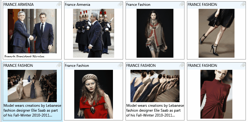
Grid for multi-content display are able to display various data, e.g. image, audio, video etd. It contains more DataTemplates, one for each object type.
You may find examples of such a style in Fred4_config.xml, Shell4_Config.xml and ted4_config.xml. In the Visual Studio, search the entire config folder for the text: <DirectoryStyle Name="Grid small"
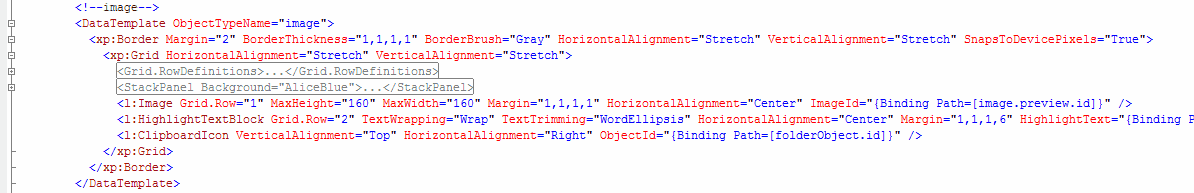
In this example there's DataTemplate for "image" object type. It appears as:
It is enclosed in a Border section, that contains a Grid section, that in turn contains row definitions with 3 rows (not shown on the following screenshot), title and the clipboard icon in the row 0, thumbnail in row 1, and caption in row 2.
This example requires three rows, thus they are defined here.
<Grid.RowDefinitions>
<RowDefinition Height="Auto"/>
<RowDefinition Height="Auto"/>
<RowDefinition Height="*"/>
</Grid.RowDefinitions>
|
A StackPanel is used to display the title.
<StackPanel Background="AliceBlue">
<l:HighlightTextBlock TextWrapping="Wrap" Margin="1,1,1,6" HighlightText="{Binding Path=[folderObject.title]}" />
</StackPanel>
|
A l:Image control is used to display the image preview.
<l:Image Grid.Row="1" MaxHeight="160" MaxWidth="160" Margin="1,1,1,1" HorizontalAlignment="Center" ImageId="{Binding Path=[image.preview.id]}" />
|
A l:HighlightTextBlock is used to display the caption.
<l:HighlightTextBlock Grid.Row="2" TextWrapping="Wrap" TextTrimming="WordEllipsis" HorizontalAlignment="Center" Margin="1,1,1,6" HighlightText="{Binding Path=[folderObject.summary]}" />
|
A l:ClipboardIcon is used to display the clipboard icon on top of the section.
<l:ClipboardIcon VerticalAlignment="Top" HorizontalAlignment="Right" ObjectId="{Binding Path=[folderObject.id]}" />
|
|
