Directory styles with slider
For GN4 client applications, you can control the level of detail displayed in a directory style. This allows a slider to change the level of detail (e.g. size of a thumbnail) displayed, and also transition between one DirectoryStyle to another - this effectively allows directory styles to be combined in one continuous range.
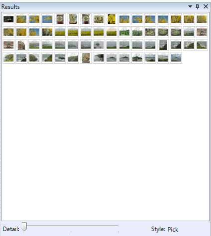
The following shows the detail slider in the minimum position:
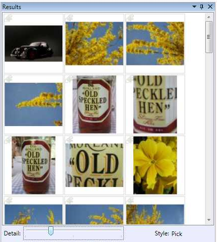
Moving the slider, expands the size of thumbnails:
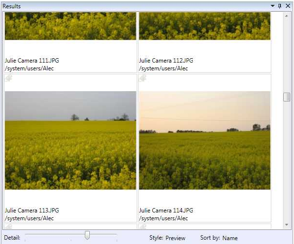
Moving the slider more, moves onto the next directory style:
For this to work, all of the DirectoryStyle elements in a particular BaseQuery must have the detail values MinimumDetail, DefaultDetail and MaximumDetail attributes defined on them.
The slider then controls a CurrentDetail value that is available to the directory style to control some aspect of the layout - in the following case, it's the height of a thumbnail.
The MinimumDetail and MaximumDetail values in each directory style do no necessarily be a continuous range as in the following case.
The slider will be divided up into regions, one per directory style. As the slider moves through the region it supplies the CurrentValue to the associated directory style. When the slider moves to the next region, the next directory style is selected and the CurrentValue adjusted to match the directory style's detail range.
Selecting the directory style from the list will display the directory style using the DefaultDetail value.
To access the CurrentDetail value from within the directory style use the following binding:
Width="{Binding Path=CurrentDetail, RelativeSource={RelativeSource AncestorType={x:Type l:ShellResultView}}}"
The following is a larger fragment showing two directory styles:
<DirectoryStyleList>
<DirectoryStyle Name="Pick" MinimumDetail="20" DefaultDetail="40" MaximumDetail="200">
<DataTemplate ObjectType="img">
<Grid>
<Border
Margin="1" BorderThickness="1,1,1,1" Padding="1,1,1,1" BorderBrush="LightGray" >
<Image HorizontalAlignment="Stretch" VerticalAlignment="Stretch" Stretch="Uniform"
Source="{Binding Path=[img.thumbnail], Converter={StaticResource IdToImageConverter}}"
Width="{Binding Path=CurrentDetail, RelativeSource={RelativeSource AncestorType={x:Type l:ShellResultView}}}"
Height="{Binding Path=CurrentDetail, RelativeSource={RelativeSource AncestorType={x:Type l:ShellResultView}}}" >
</Image>
</Border>
<l:ClipboardIcon Content="Clip" VerticalAlignment="Top" HorizontalAlignment="Left" ObjectId="{Binding Path=[img.id]}"
Command="{x:Static l:Commands.ClickScript}" CommandParameter="ToggleClipboardClick"/>
</Grid>
</DataTemplate>
</DirectoryStyle>
<DirectoryStyle Name="Preview" Description="" MinimumDetail="200" DefaultDetail="200" MaximumDetail="400">
<DataTemplate ObjectType="img">
<Grid>
<Border
Margin="1" BorderThickness="1,1,1,1" Padding="1,1,1,1" BorderBrush="LightGray" >
<StackPanel Orientation="Vertical">
<Image HorizontalAlignment="Stretch" VerticalAlignment="Stretch" Stretch="Uniform"
Source="{Binding Path=[img.preview], Converter={StaticResource IdToImageConverter}}"
Width="{Binding Path=CurrentDetail, RelativeSource={RelativeSource AncestorType={x:Type l:ShellResultView}}}"
Height="{Binding Path=CurrentDetail, RelativeSource={RelativeSource AncestorType={x:Type l:ShellResultView}}}" />
<TextBlock Height="Auto" HorizontalAlignment="Left" Text="{Binding Path=[img.name]}" />
<TextBlock Height="Auto" HorizontalAlignment="Left" Text="{Binding Path=[img.folderRef:DescName]}" />
</StackPanel>
</Border>
<l:ClipboardIcon Content="Clip" VerticalAlignment="Top" HorizontalAlignment="Left" ObjectId="{Binding Path=[img.id]}"
Command="{x:Static l:Commands.ClickScript}" CommandParameter="ToggleClipboardClick"/>
</Grid>
</DataTemplate>
</DirectoryStyle>
</DirectoryStyleList>
StepDetail
You can specify that the CurrentDetail value is provided in multiples of a given value; this allows functionality similar to the variable line height directory style mechanism available in GN3, although using the detail slider and not a combo-box.
The standard Content tab configuration has this available on the Details directory style to display the story summary.
The StepDetail property has been added to DirectoryStyle to allows the step size to be specified.
In the following case, the line height is 16 so, StepDetail="16". The MinimumDetail, MaximumDetail and DefaultDetail should all be multiples of this, but they are rounded down internally if they are not. In the following case, MinimumDetail displays 0/16 = 0 lines, DefaultDetail displays 32/16 = 2 lines and MaximumDetail displays 80/16 = 5 lines.
For the variable line scenario, the CurrentDetail should be bound to the height of a TextBlock:
<BaseQuery Name="ContentMainTab" ObjectTypeName="folderObject">
<DirectoryStyleList>
<DirectoryStyle Name="Details" Height="1" Width="-1"
MinimumDetail="0"
DefaultDetail="32"
MaximumDetail="80"
StepDetail="16">
...
<ColStyle Name="T" Width="80" Height="0" SortName="Type">
...
</ColStyle>
...
<DataTemplate ObjectTypeName="story">
<TextBlock TextWrapping="Wrap"
HorizontalAlignment="Left" Margin="0" Padding="0"
Text="{Binding Path=[story.summary]}"
MaxWidth="{Binding Path=ActualWidth,
RelativeSource={RelativeSource AncestorType={x:Type ScrollContentPresenter}}}"
Height="{Binding Path=CurrentDetail,
RelativeSource={RelativeSource AncestorType={x:Type l:ShellResultView}}}"/>
</DataTemplate>
</DirectoryStyle>
</DirectoryStyleList>
</BaseQuery>
Note also that Margin and Padding are set to zero to ensure that the height calculation works correctly.
The MaxWidth property is bound to the width of the ScrollContentViewer which is the control hosting the content of the listings. The ActualWidth property is the width of the listing visible.
Changes in version 1.6
The binding for current detail has been simplified by the use of a markup extension CurrentDetail, e.g.:
<Image ...
Width="{l:CurrentDetail}"
Height="{l:CurrentDetail}" />
It is also now possible to provided a value that is multiplied with the current detail to gain the final value. This allows for (say) the height to be a ratio of the width, e.g.:
<Image ...
Width="{l:CurrentDetail}"
Height="{l:CurrentDetail 1.414}" />
will make the height 1.414 times the width.
Example
<DirectoryStyle Name=".... MinimumDetail="10" DefaultDetail="20" MaximumDetail="30">
The above means:
•When you open this directory style, it will open with the details level specific by DefaultDetail, e.g on "20". The value is relative to the total range between the lowest MinimumDetail and the highest MaximumDetail.
•If you move slider left, the current directory style will remain, until you exceed the MinimumDetail - assuming, there's a directory style whose MaximumDetail is the same as MinimumDetail of the current directory style - then it will switch to that directory style.
•If you move slider right, the current directory style will remain, until you exceed the MaximumDetail - assuming, there's a directory style whose MinimumDetail is the same as the MaximumDetail of the current directory style - then it will switch to that directory style.
•All of the above make sense if there are more directory styles in the DirectoryStyleList.
•The slider will switch also between list and grid directory styles. In grid directory styles, the thumbnail size is proportional to the position of the slider - move it right to increase the size. In list directory styles, slider does not change anything.
Example of three slider directory styles, concatenated one to each other:
<DirectoryStyle Name="List" Height="1" Width="-1" MinimumDetail="10" DefaultDetail="15" MaximumDetail="40" >
<DirectoryStyle Name="Thumbnails" MinimumDetail="40" DefaultDetail="100" MaximumDetail="100">
<DirectoryStyle Name="Workstates" MinimumDetail="100" DefaultDetail="150" MaximumDetail="400" >


