Considerations about body text flow
Text flows in a slightly different way in Fred and in InDesign. This is due to the different justification engine. Therefore, you cannot pretend to get the precisely the same text justification in both softwares, but you will surely want to come as near as possible.
To locate the appropriate zoom level
The first step in comparing the text flow is to find out on which zoom value in both applications the shapes has exactly the same dimensions.
On the Full HD screen resolution, the Fred zoom of 213% corresponds to the InDesign zoom of 204%. This value may vary with different screen resolutions.
The way to find it out is the following:
1.Set the similar zoom in both applications and then capture the same part of screen (containing text or shapes).
2.Paste both on a slight overlap in a suitable application (Powerpoint).
3.Check if the borders correspond. On the following screenshot, the column grid snaps perfectly. This means you've found your corresponding zoom levels.

To compare the text flow
1.Adjusting the zoom level to the values you've located in the previous step, capture the same text formatted in the same way in both applications.
2.Paste the captures in Powerpoint.
3.Make one of the two transparent (How?) and then overlap them precisely and review the flow:

As you can see, there are parts where the text flows pretty similarly (the 2nd and 3rd paragraph), and the parts where the flow is not the same. In the first paragraph, for example, Fred used two more words ("for a") where InDesign moved them in the second line - and that causes the flow difference. On the bottom of the second colum, InDesign moved the word "debate" to the third column, whereas Fred hyphenated it.
The general conclusion here could be that the text flow is similar enough.
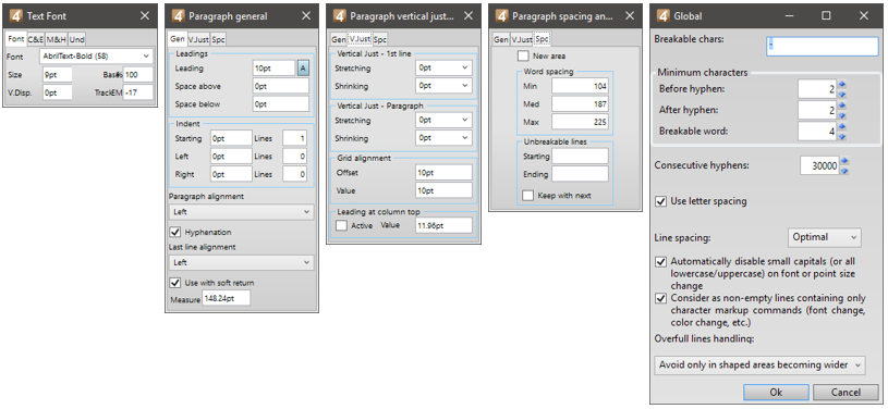
This text flow is based on the following format properties, that are based partially on the InDesign values, but also on the observations of the text flow and numerous adjustments until we reached the point of the best similarity

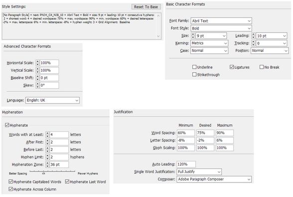
The InDesign values were:
Making the text to flow temporarily in the same way to check better
To check the text flow better, you can force text to flow in Fred in the same way as InDesign.

How you force text to flow in Fred in the same way as InDesign?
•Pushing in Fred "for a" to a next line: in this particular format that has no standard indent, we simply pressed the Return key. If the format would have a standard indent, then you would need to remove it temporarily by means of the Paragraph palette.
•Forcing in Fred the word "College" to hyphenate: the only way was to apply a slight right indent, of 11 pt.
•Avoiding that the 11pt right indent moves "of" i 4th and 5th line to the new line: again, we forced the new paragraph on the line that starts with "the scenes" and then reduced the right indent to 7pt.
•Avoiding that the "debate" would be hyphenated: we pressed SHIFT+CTRL+- before the first letter of the word "debate".
u Proceed to the next topic in the table of contents.

